
Unisys
Overview
Unisys was preparing to launch their new brand, one of the biggest transformations in their company history. One of our biggest challenges with their new brand was that it was visually stunning, but a challenge to make sure the colors worked together in an accessible and seamless way. We also only had a few weeks to launch their website as this new brand was being launched by a set date.
Role
I led design both on our agency side as well as on the client design team side, helping establish a cadence for reviews, building the foundation for a design system that ultimately the Unisys team would maintain after we launched the site, and making sure both my team and the Unisys team was working in a cohesive way. I also partnered closely with our frontend engineering team to bridge the gap between development and design.
After launch, I remained on the project and worked closely with their team to prioritize features that focused on turning the website into a lead generation tool.
Initial Kickoff
To kick off the project, I joined a call with the designers and front end engineers to see the new logo and visual identity from the branding agency that Unisys hired, and homepage and solution detail concepts to match. We were looking to understand the overall direction and create a plan to help Unisys to launch this website by a quickly approaching deadline. In just under 3 months, our team took those concepts into the new Unisys.com.

A sample of what we were provided at the kickoff - the new logo, a handful of module concepts, approved colors, and suggested color combinations.

Design System Creation
In order to produce page designs quickly and easily, the team knew the first task was reskinning the existing modules from the site with the new brand. I helped the design team conduct a component audit, and took ownership of building out a design library. Once we figured out the color combinations, font weights, and base level components, the team could start producing the most critical pieces of the pages.
I helped maintain this design system and took ownership over approving and adding in new modules and components as we worked through the page designs. The designers on the team (across WillowTree and Unisys) collaborated to create full page mockups that used these approved modules over the next few weeks.

key takeaways and lessons learned
Component and Design Tracking
The team identified that there were challenges in tracking the design progress as it moved from Figma into Azure DevOps. I created a sticky note tracker that linked Azure DevOps tasks, designs, and a designer and engineer “author” to track progress as pieces moved from design into development.
Working collaboratively across timezones
Both the WillowTree team and Unisys team were spread across timezones. And because of the tight timeline to launch date, we needed to get to a normed team quickly. I helped lead norming sessions with the Engineering leads to increase positive collaboration and build trust, which was critical for our success.
Designing a new, improved, and accessible site
With a vibrant new color palette and visual identity, we needed to make sure that everything we created and added to the design system was WCAG AA compliant, but also visually stunning. Our team helped champion for accessible design and development of the new site.
post-launch + additional design work
Solutions Improvements
After launch, we focused on a critical component of the website - solutions pages. They showcase the services that Unisys offers and help turn site visitors into customers. We did a mix of updates that were important for overall visual design and impact, but also looked at updates we could make based on behaviors we saw from the first few months of the new site being live.
One page that was left off of initial launch was the landing page showcasing all solutions. We found through our analysis that many users were using these pages to try and easily browse solutions, but the initial design was using accordions. This made it tough for people to truly browse and get an overview of each solution before deciding. We designed a page that takes advantage of the new expressive icons in the brand to add visual interest, and summarized each solution in a single statement to make it easily scannable by visitors.
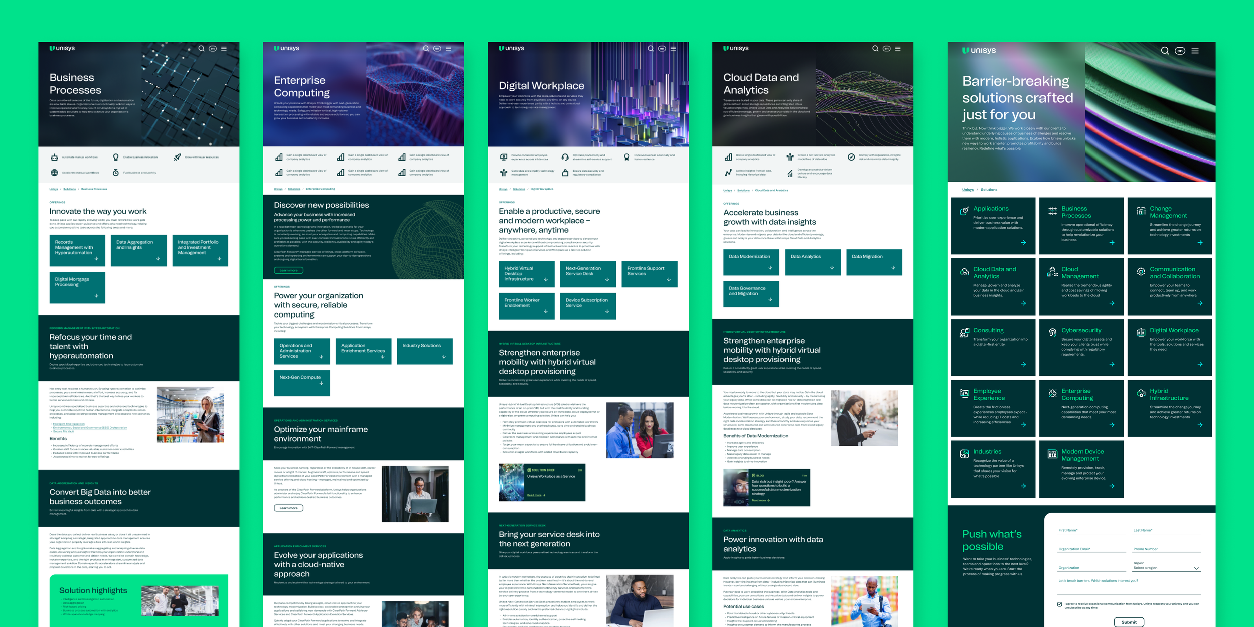
Sampling of Solutions pages (left), Solutions landing page design (right)

Hero image accessibility audit
Photography behind text can be a challenge to make accessible and was a huge part of the launched website. Our team did an audit of the site to identify which hero images pass AA compliance and which do not using the Contrast Figma plugin.

Landing Page Templates
I lead our design team in the creation of templates for landing pages. I worked with publishing and content teams to understand what information was critical to convert site visitors into customers and make sure we used modules already in the design system where possible and then oversaw the design and direction of the templates.

Color and Accessibility Guidelines
There was a desire to make modules even more customizable, where publishers could select any color combination from the brand palette. At the end of our project, I created a quick reference guide for publishers to pick accessible and on brand color combinations.